
Making Data Count in Reaching the Unreached
Gathering people group data is important, but how we use it is just as important. There is more than one way to use the data to help shape strategy or inspire mobilization.
Recently, I used a data technique to help a group make a specific decision. But when I showed it to my colleagues, they pointed out that it could be used more widely. So, I share it with you now as an example of what can be done with prayer, with Joshua Project data and with a bit of Excel skill.
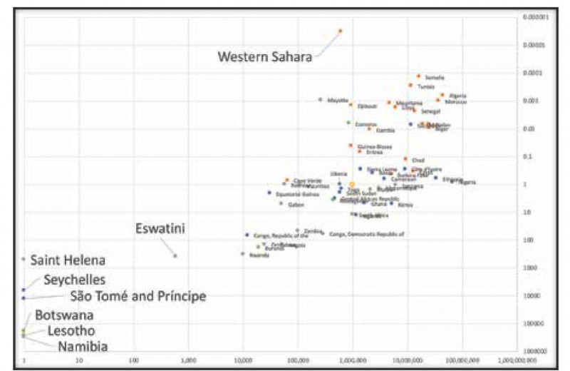
We in the Global Data Initiative (GDI) are turning our attention toward Africa. We want to improve the quality of people group data and there are many reasons to focus on this area of the world. But of course, Africa, while not as big as the world, is still a vast continent with vast differences between countries. Where should we start? We went through a process of prayer and consideration, which included drawing a chart of African countries.
There are ways of presenting data to emphasize something that has already been decided, or to motivate people towards a goal that is not in dispute. Maps can be particularly useful in this role. But maps are not always so useful to help us make the decisions themselves. To help make decisions, I often use a “scatter chart” because you can express two different factors quite clearly in one view. Which two factors you choose depends on your concerns.
Jesus himself expresses two related concerns when asking us to pray for more workers. He says that the harvest is plentiful, and the workers are few (Matt. 9:27 and Luke 10:2). He links these two different factors to the deployment of workers— asking the Lord of the Harvest to “send” them or “throw them out” into the harvest field. Both the harvest, and the workers can be understood in different ways. For GDI purposes, I chose to take the harvest as being the population of people in Joshua Project’s “Scale 1” peoples—the least reached or “unreached.” For “workers” I chose to take the population of evangelical Christians. I added up all that data by country.
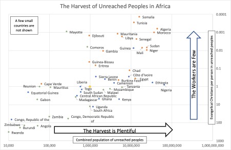
The way that the Joshua Project maintains their data makes it relatively easy to use it to support strategic decision making and I have made use of this before for several global networks1. Note that Joshua Project’s definition of evangelical Christians is people who believe in the authority of the Bible, the uniqueness of Jesus, the importance of personal conversion and the need to pass on our faith. Most of those are Protestants, Anglicans, Pentecostals or belong to independent churches, and some are Orthodox or Catholic.
When Jesus says that the workers are few, I assume that He is meaning “few, relative to the harvest.” If we have 100 acres waiting to be harvested and 100 workers who could do the job, that is “fewer” workers in my book than if we have 10 workers ready to harvest one acre. So, on the vertical axis I charted evangelical Christians (the “workers” who could be “sent out”) relative to the harvest among the least reached in the country where they live.
Now we had a view of Africa as a whole, and we were able to see some big differences between the countries.
On the left of the chart are countries with a small population among unreached peoples. On the right of the chart are countries with a large population among the unreached. The harvest, waiting out in the fields for workers, is more plentiful in countries on the right. And the difference is very large! Every vertical grid line on the chart indicates a difference of ten times. And you multiply as you go, so there is a thousand times larger harvest waiting to be reaped in the countries In the right-hand grid squares than in the left-hand squares. For example, among unreached peoples in Ethiopia there are a thousand times more people waiting for the gospel than among unreached peoples in Equatorial Guinea.
Now where are the workers the fewest? Countries at the top of the chart have a million times fewer workers available to reap their harvest than those in the bottom grid squares (relative to the harvest available).
This begins to tell us a number of things of strategic importance. The first thing to consider is simply the amazing diversity of the situation. It is likely to be very different trying to reach the unreached in Rwanda (bottom left), Mayotte (top left), Somalia (top right) and Nigeria (middle right). Our tactics may be similar. Surely the tactics of prayer, faith, self- sacrifice, love, learning new cultures and translating the Bible will all be involved. But our strategy may need to be very different. Who are we going to mobilize and motivate to reach the unreached in Mayotte? Should we mobilize the church in Rwanda to reach the unreached in their own country, or abroad? We will come back to that question in a moment. Before we do, let’s just note the significance of a particular line across the middle of the chart.
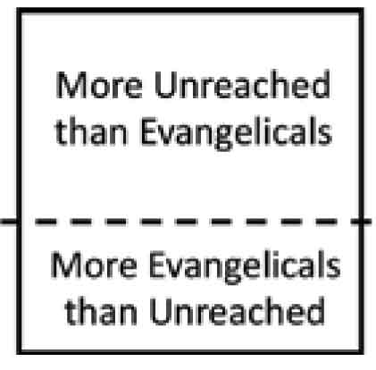
The line is labelled “1”, meaning that there is just one evangelical for every unreached person in that country. Above this line the countries have more people among the un- reached than evangelical Christians. Below, there are more evangelicals. That is an interesting milestone.
In fact, we could characterize the chart in three fuzzy horizontal bands: “More Reason to Come,” “More Reason to Stay” and “More Reason to Go.”
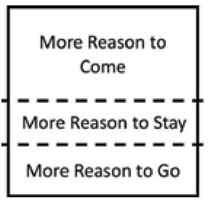
The core of the central band is probably formed by these ten countries: Benin, Burkina Faso, Cameroon, Cape Verde, Chad, Côte d'Ivoire, Egypt, Eritrea, Ethiopia and Sierra Leone. Their ratio of workers to unreached is not far off the global average2. So, in terms of reaching the global unreached, there is not much to be gained by sending in lots of foreign workers to these countries, nor by asking them to send many abroad. The need and resource are well balanced. Of course, if one of these countries has a particularly vigorous church, let them develop international sending structures! If one of them has a church lacking vision or vigor, we may need to send people in. But in general, it is to countries below this band that we must look for international workers, and to countries above this line that we should expect to send them.
I have colored the dots by latitude. The northern third of countries are represented with an orange dot, the middle with blue and the southern by green. Notice that most of the northern countries are in the top of the chart, most of the blue in the center and most of the green near the bottom. This vindicates and supports the basic validity of a current prophetic message from the African Church to the African Church—“GO NORTH!”. There are some exceptions, most notably with Mayotte and the Comoros. But in general, in Africa, NORTH is where the harvest of the unreached lies.
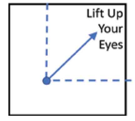
I have referred to Jesus’ comment about the workers and the harvest. At a different time, Jesus said, “Look, I tell you, lift up your eyes and look at the fields because they are white for harvest” (John 4:35) and we might use information from this chart to help Christians in a particular country where to “lift up their eyes”. On this chart that means, wherever your nation is on this chart, you can “lift up your eyes” toward the top right. Those are the countries where the harvest is more plentiful and the workers are fewer than in yours.

My thinking is this. While the Holy Spirit may direct specific individuals “from anywhere to anywhere,” it doesn’t make sense for us to encourage large numbers of people to move at random around the world, even less to pray for that! Shouldn’t our prayer to the Lord of the Harvest be to throw out workers from countries where harvest in meager and the workers, many, into countries where the harvest is more plentiful and the workers are fewer? And shouldn’t our mobilization effort be in the same direction?
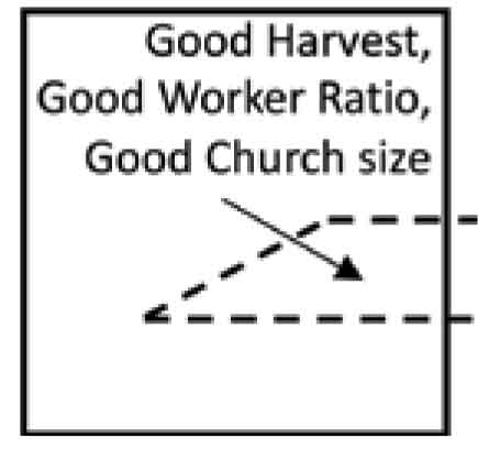
To return to the question at the beginning—if we want to encourage African countries about using data, and about their own research into their own unreached peoples—where should we start? We are still working on it, and a lot depends on personal relationships. Nevertheless, there IS an area of the chart that interests us most. We are looking for countries where there is a good harvest in the country and a good-sized church that can tackle the research, the data management and good reason to use that data to mobilize that church … to reach their own nationals. These are not countries where the workers are few, nor where they are very many, but somewhere in the middle!
Endnote: For simplicity this article uses a chart of the majority of countries in Africa. There are a few countries quite literally “off the chart”. We can “zoom out” to show one more country at the top and a few to the left of the chart. Western Sahara has 100 times fewer workers than Tunisia, although the harvest is smaller too. For this chart I have imagined that somewhere in each of the six countries on the extreme left there is at least one person from an Unreached People Group, although there are none in the Joshua Project data.


comments