Wow, Who Knew? Fonts are Needed for Bible Translation?
Such was the reaction of an American pastor upon hearing that font development was the ministry focus of Annie Olsen, a type designer for SIL International. It’s not an uncommon reaction, either, at least among people who speak English (written with just 26 unaccented letters of the Latin script) as their native language. A fully developed digital font—a set of letters and symbols, plus underlying instructions—enables a computer or other device to print a script properly on a page or display it on a screen.
Then what, exactly, is a script?
A script in this context is a system of symbols used for writing. The more than 7,000 living languages of the world use over 140 different scripts today. You’re reading here the English language written using Latin (or Roman) script. Latin script is also used for thousands of other languages, though often with some modifications such as diacritics (accents or other marks) or slightly different letter shapes. You may also be familiar with other scripts such as Chinese, Hebrew, Greek or Arabic, recognizing their appearance even if you can’t read them.
In our modern age, computers—and thus, fonts—play a crucial role in enabling people from every people group and nation to have access to God’s Word in the language and script they know best. SIL International’s Non-Roman Script Initiative (NRSI) team was formed to address the technical challenges encountered when using different languages and scripts on computers.
In some parts of the world, just using the correct script is not enough; the style of the script is also really important. The Arabic script, for instance, has several distinct styles of writing used in different parts of the world. The illustration below right shows a style of Arabic writing commonly found in West Africa. On the left is the same text printed using SIL’s Arabic script font, Scheherazade, which is designed to match the standard (or Naskh) form of Arabic.
For people used to reading the West African style of Arabic, Scriptures printed using the Scheherazade font would look “foreign” to them, even if the language was correct. They would also find it harder to read because of the difference in style. For years this was a problem for Bible publishers in that region, since there was no suitable font available to them.

Left: Arabic printed using a font called Scheherazade, designed by SIL International. Right: Arabic writing style commonly found in West Africa.
In 2015, the NRSI team released a new font called Harmattan, which was designed specifically for the style of Arabic used in that region. Here is the same manuscript sample with NRSI’s Harmattan font on the left:

Arabic in the Harmattan font designed by SIL International (left) compare to the same West African manuscript (right).
It is easy to underestimate the impact a font can have on a language community that isn’t accustomed to seeing printed documents in their style of writing. An inappropriate font can be a barrier that discourages people from reading Scripture and responding to it.
In 2014, when the Harmattan font was being developed, one of our West Africa field testers said that during an extended reading session with an older man he read almost twice as fast using Harmattan as opposed to Scheherazade. Around the same time, field testers met with a government agency responsible for literacy use of the Arabic script, and they loved the book of Genesis in the Harmattan font! Using the right font can break down a barrier, making Scripture more accessible.
About Those Latin (and Cyrillic and Greek) Letters
NRSI was established to find solutions for challenging scripts like Arabic. However, there are also complexities in some languages that use Latin script. The first is simply having all the necessary letters and symbols. Even a single missing letter makes it difficult, if not impossible, to write a language correctly. All of SIL’s Latin fonts—Charis SIL, Doulos SIL, Gentium, Andika—have comprehensive support for not only Latin script, but also Cyrillic letters and their many variants. Gentium also includes complete coverage for the Greek script.
The right letter shape is also important, especially for people learning to read. Literacy specialists have often observed new readers being confused by letters whose shapes are too similar in some fonts. This design problem is addressed in Andika, a sans serif font based on decades of legibility research, resulting in clear, distinct letterforms.
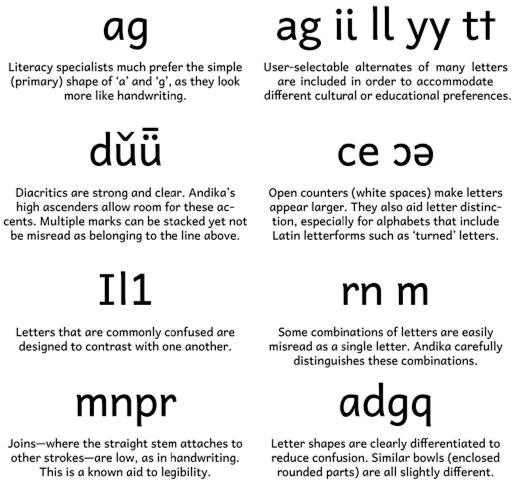
Design choices made by the creators of the Andika font.
First released in 2009, Andika has been welcomed by educators in and out of SIL.
Just as the Harmattan font can remove a barrier for West African readers of Arabic script by displaying text in an appropriate style, so Andika can remove a barrier for new readers of Latin script by displaying text that is clear and easy to read.
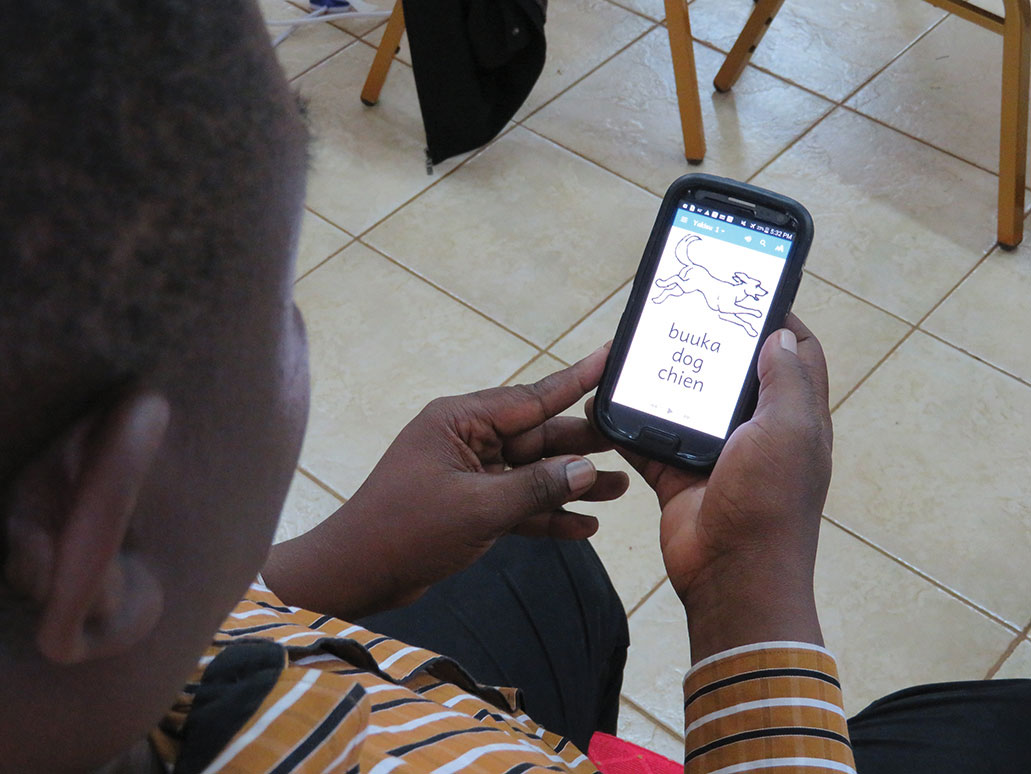
An application built using SIL's Reading App Builder displays "dog" in Waama (a language of Benin), English and French using the Andika font.
Tai Viet: A Lesser-known Script
Some lesser-known scripts have a long history but few, if any, font options. For example, the Tai Viet script has been used for 500 years to write several different languages spoken in southeast Asia. In this complex script, vowels may be placed before, after, above or below consonants depending on the syllable. Consonants also indicate tone by a variation in shape. The letter shapes are not combined; rather a person writing this script learns to avoid collisions by careful placement. A computer font, however, needs those rules to be explicitly coded and added to the font.
Bible translation began in one of these languages, Tai Dam, in the late 1960s. Although the language has been written with the traditional Tai Viet script for centuries, in recent years the Latin and Lao scripts have also been used to write it, influenced by the national languages of the countries where it is spoken. The first Scripture portions were published in 1978 in all three scripts—with the Tai Viet sections all written by hand!
A translation team member began asking how to turn this script into a computer-friendly font. Beginning with letters drawn by a Tai Dam artist, SIL’s first Tai Heritage fonts were programmed for dot matrix printing. Then font technology changed again, and these fonts were converted to the new format in the mid 1990s. In 2007 all the letters and symbols of the Tai Viet script were added to Unicode, the computing industry standard for handling writing system data. Following this, the Tai Heritage font was once again updated and released in 2009. The most recent update was October 2017.
Three editions of the New Testament in the Tai Dam language were published in 2013 and 2014, one for each script. Some have been distributed to local speakers and are being studied by young people seeing these words in their own language and script for the first time.
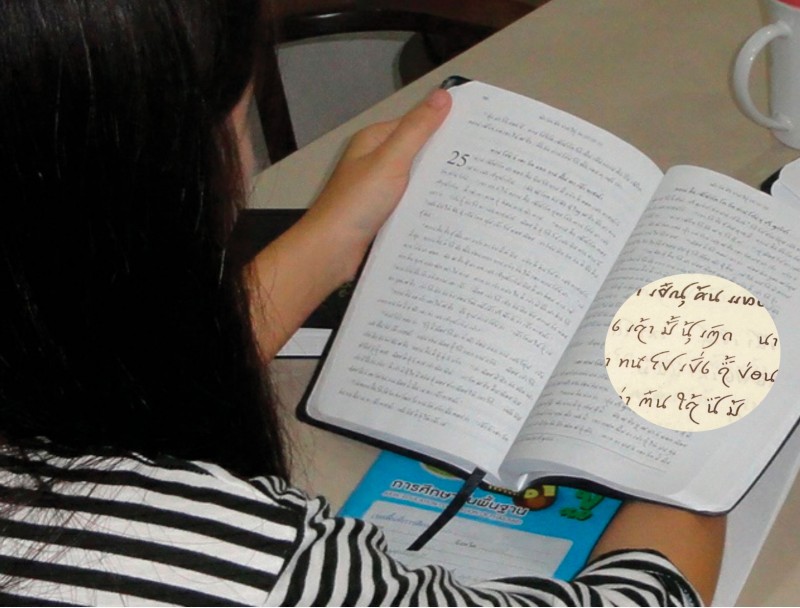
Reading the Tai Dam New Testament published in the Tai Viet script (using SIL's Tai Heritage Pro font).
Using the world’s many different scripts (including Arabic, Latin and Tai Viet) on computers presents a variety of technical challenges that need to be overcome to enable those from every people and nation to read God’s Word in the language and script they know best. Developing the right font for the right context is key to making God’s Word available in written form to more people groups around the world.




comments